Data Center Tips
The more you use the Data Center, the easier it will become to find the data you need. However, we have a few hints that may save you time as you begin searching for information. As a reminder, indicator definitions and notes can be found at the bottom of each indicator page, after you’ve selected your indicator from the Data Center.
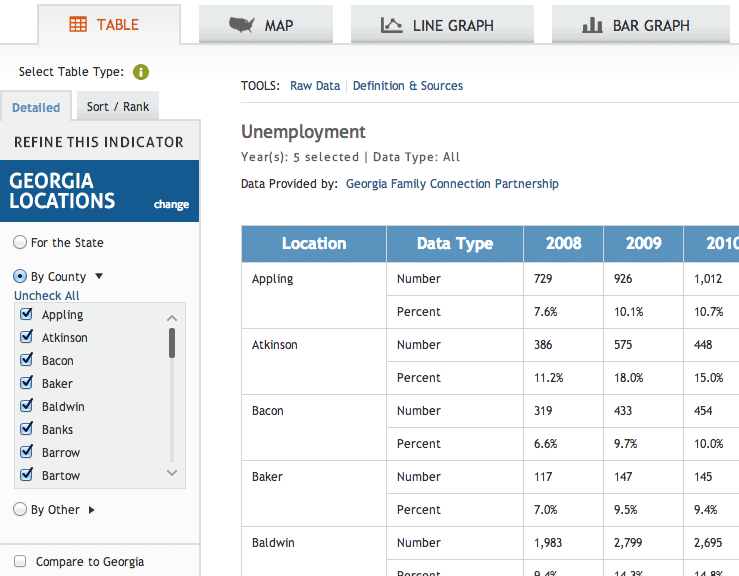
Once you’re in the Data Center and have selected an indicator (all Georgia KIDS COUNT indicators are available by county), you’ll be at a screen like this one:

The first reminder is to choose how you want to display your data – by table, map, or graph – as seen at the top of the screen, before choosing the counties you want to display.
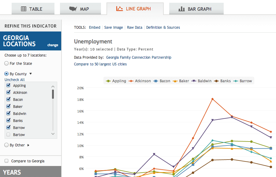
For example, if you clicked the “LINE GRAPH” tab, you’d arrive at a screen like the one pictured below, at which point you would choose the area or areas you’d like to compare or review.

From here, if you want to look at or compare specific counties (you can view up to 10 at one time), you would click the blue “Uncheck All” link right above the scrolling counties box.
Next, if you also want to compare the selected county or counties to Georgia, you would click the “Compare to Georgia” checkbox located below the scrolling counties box.
Disclaimers for Individual Indicators
GED Graduates Both the cost and content of the GED exam changed in 2014, and a result, the number of GED graduates decreased dramatically. In many counties, the decrease in GED graduates was around 90 percent. Because of this dramatic change, comparing data from before 2014 to data from 2014 and after will be misleading.
Teens ages 16-19 not in school and not working There have been substantial changes made to the 2008 American Community Survey (ACS) questions on labor force participation and the number of weeks worked. After thoroughly investigating the extent to which each of the KIDS COUNT indicators of economic well-being may be affected, we believe that the changes in methodology were significant enough to constitute a break in the trend. We, therefore, do not recommend that you make comparisons to previous years’ estimates. For more detailed information about the changes made and tables comparing 2007 and 2008 state-level estimates of employment and unemployment read The Census Bureau notes.
Free and Reduced Price Lunch The Data Team removed the Free and Reduced-Price Lunch indicator. A new federal program has granted automatic free and reduced price lunch to 100 percent of children in school systems where at least 60 percent of kids previously qualified in an effort to expand food access to low-income areas. This change artificially inflates the indicator, so it is no longer a reliable measure of low-income children and families. However, several indicators can still inform a county’s understanding of poverty, food access, and related issues, including the following:
Other Data Tips
Rate vs. Percent
Some indicators are presented by their rate, usually per 1,000. For example, the incidence of teenage pregnancy is displayed as the number of teen girls who are pregnant in a given geographic area per every 1,000 teenage girls. So, in Meriwether County, the teenage pregnancy rate for girls ages 15-17 was 36.4 per 1,000 in 2012.
On the other hand, some indicators are displayed as a percent. Unlike a rate, a percent is the number of events in an area divided by the whole target population in the area. For example, in Chattahoochee County, 24.4 percent of children live in poverty. This means that the number of children living in poverty was divided by the total number of children in the county.
The data center and data products often show the number of events in a given area. In the example above, the data center displays the actual number of teen girls who are pregnant in a given county. However, listing the number alone does not allow comparison between counties with different sizes and populations, and makes it difficult to understand the full picture as it changes over time.
Small Numbers: When fewer than five events occur in a county in a year, only the number of events will be posted. Rates are neither calculated nor posted. For example, if Dooly County had fewer than five teen births in 2005, only the number of teen births, and not a rate, would be posted.
Data Sources
Different data sources often have different definitions for the same indicator. For example, high school graduation data can be difficult to compare across data sources, because the school district data and county data may not be the same, even though each system is reporting on the same indicator.
You may also notice discrepancies in data between what is reported by larger state and national organizations, and what you may receive directly from a local source. This is because organizations and agencies, including those used by GaFCP, often have longer and more complicated processes for collecting, verifying, and ultimately reporting data. The exact definition for the indicator may also differ.
Data Timing
You may notice that the most recent year for data listed for some indicators is not the present year. In fact, you may even notice a multi-year delay. There are a few explanations for this, depending on the indicator. Generally, though, the culprits are either data availability—some data simply may take more time to compile—or data reliability, which means the data may take some time to verify and “clean up” for public use. Regardless of the reason for the delay, GaFCP and KIDS COUNT work around the clock to make sure that the most current and accurate data available is posted in a timely manner.
