Getting Trendy with KIDS COUNT Data
Print This PostNumbers by themselves don’t make sense. They must be organized and presented in ways that tell a story, and there are right and wrong ways to do that. The worst way is to manipulate numbers so they appeal to desire by hiding truth. Remember Enron?
A more common, but less sinister wrong way of presenting numbers is failing to consider that the way we portray data can alter conclusions. For instance, think about a person trying to lose weight. If we look at Chart 1, which shows weight gain from April to June, it appears that things are getting worse.
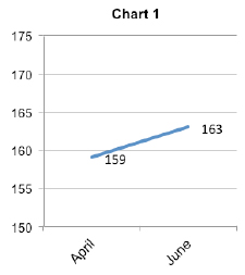
That same data presented in Chart 2—this time from October to June—show that, with some fluctuations, there’s actually real improvement over a nine-month span.
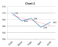
The red trend line in Chart 2 is hidden in Chart 1. Studying trends over time always uncovers the untold story we miss by glancing at an isolated change between two points in time.
Are We Making a Difference for Georgia’s Children and Families?
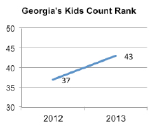
We can apply that to Georgia’s national KIDS COUNT ranking. This chart shows the change in Georgia’s rank compared to the other 49 states from 2012 to 2013. This looks like bad news for Georgia’s children.
Now let’s look at the trend for Georgia’s rank since The Annie E. Casey Foundation inaugurated KIDS COUNT in the early 1990s. The red trend line helps us make sense of Georgia’s ranks over time. Things appear to be getting better but there are still confusing fluctuations from year to year.
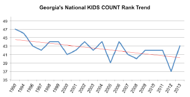
A common technique used to clarify fluctuating data is to show three-year averages. For example, the data point for 2013 in this chart is the average rank for 2011, 2012 and 2013. This widely accepted technique smoothes out the ups and downs of trend data and tells a simpler story with the underlying truth intact and easier to see.
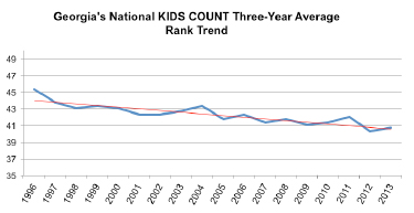
While the news for Georgia’s children from 2012 to 2013 isn’t good, the news is much better when we take a longer look at the trend for Georgia. Conditions for children are getting steadily better, even with annual fluctuations. Even so, you might say that the rate of change is not fast enough. But consider this: Georgia achieved the ninth biggest improvement in the nation in three-year averages from 1996 to 2013. Among the 12 Southeastern states, only Virginia and Tennessee did better, and among the states anywhere that ranked in the bottom 15 in 1996, only Tennessee and Florida have done as well as Georgia.
So, from all of this, I’ve come to two conclusions:
- We as Georgians still have many struggling neighbors and therefore much to accomplish to improve both their lives and our state’s overall well-being, and
- We cannot let ourselves become discouraged and overwhelmed by all the grim numbers; instead we must look at the good work that we have already accomplished on behalf of the families and children of our state.
The trend numbers tell us we’re headed in the right direction. So, let’s keep doing what we’re doing—just more of it.
